Sunday, November 28, 2010
Break Time
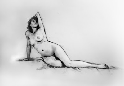
Break was great though and extremely relaxing! Get ready to draw!
Sunday, November 21, 2010
Crit on long portraits & the longer one to come..
So now we proceed into the large-scale skeletal structure. With so much time spent on one drawing, I'm concerned most with becoming bored or uninterested in the subject matter. This will unmotivate me to continue. With that said, I have briefly researched other life drawing styles on Google--sorry it is too cold and wet out for me to venture to the library.
This first one is done by Stephan Perreault. I enjoy it because the silhouette of the actual form and body is clean and concise. I enjoy the shading of the background being dark and the highlights of the picture being colored in white charcoal. I think this one is most reminiscent of my style of work because of the simplified, slightly cartoonish-style; clean, soft lines and angles:

This next one is pretty interesting based on the simplification the artist is representing. There is enough value information to recognize a form, however the details have been lost seemingly to preserve anonymity of the individual models. The almost non-existent outline of the bodies still reveal a sense of the form. I enjoy the use of value in this one. The treatment may be similar to what I transfer on the painting we do in the coming weeks.
 The shadows of this last one is perfect for the value I would like to include in my long-portraits. I love that soft, blurred style where the figure or object seems to be sitting in a shadow.
 This last one I included simply because I LOVE pastels. I've worked with them for 9 years now and I can't get enough of them! I'm almost thinking now that my long-portrait will be one drawing instead of two, but the finishing touch will be to go over and redo the value with pastels to get a more realistic piece. What are your thoughts?
Sunday, November 14, 2010
Long Portraits
So for two weeks now we’ve been working diligently on long portrait drawings. We will complete three all together, spending three hours on each of them. Originally I thought this would be overkill for a portrait, but honestly it was a lot of fun. The half hour breaks made things very manageable for the artist and the model. Plus, these past few weeks I did not hear complaints about drawing. Everyone seemed to enjoy the project. I loved the detail I was able to get while observing the model for such an extended period of time. Each half hour I tried to focus on a different landmark or feature of the face and neck. Since the views were mostly ¾ front or back, there seemed to be a definite silhouette line that I loved to begin with. That outside edge set up everything for me. It gave my face shape and even definition for recognition. If that line was proportional to the face I was drawing, most likely the whole drawing would be relatively proportional. I really enjoyed how the drawings turned out, although as an artist I feel my work is never done and can always be revised or improved. For now, I have decided not to dwell on the drawings for fear of ruining them. I'll post all three drawings next week after the critique, for now here's the latest portrait of my friend Brick:
Returning to my statement about the outside line actually giving recognition to the model in front of me, I think of the number one rule of graphic design: Simplify. In logo design the basic idea is to convey a message or embody a company’s theme with as little substance as possible. To take any object and simplify it to its most basic structure, while still preserving that message. I love this idea of defining a person by that outside silhouetted line. I think for next time I’ll discuss how the critique goes on Monday and then during the week so various experiments in attempt to capture individuals with as little detail and features as possible. I’ll post more later!
Sunday, November 7, 2010
Self Portraits in a Nut Shell
I enjoyed this specific self-portrait of Max Beckmann because the craft technique reminded me most of the charcoal drawings we are experiencing in class, however this was made with dry point. In particular, I enjoy the nose quality and definite plane change from the bridge of his nose to the vertical front of the forehead. I like the plane definition of the under-eye lid as well as the hatch-technique shading. Here's the piece titled Large Self-Portrait, 1919 Max Beckmann


